
BPP mobile app
Enhancing the learner experience
overview
BPP’s existing mobile app offered limited value to learners and frequently redirected them to the web experience, creating friction and low engagement.
With an upcoming decommissioning of legacy desktop systems and a need to modernise the student experience, we were tasked with delivering a mobile app that would meaningfully improve day‑to‑day logistics for students — under tight time constraints.
As the Head of Product Design, I supported creation of the product vision, prioritised the MVP scope, directed research and co‑creation with students, partnered closely with Engineering and Product Management to deliver a feasible, high‑impact release.
the legacy.
the problem.
Our research identified that students primarily used the app to manage the operational side of studying at BPP, rather than for active learning. They wanted a single, reliable place to stay organised — yet the existing experience was fragmented and often redirected users to the web, creating friction and low trust.
Students wanted:
A simple way to know where they needed to be and when
Live timetable updates and notifications
Faster access to support and admin tools
Visibility of attendance, payments, and queries
Direct communication channels with tutors and coaches
A more centralised “single place” experience
We needed to:
Deliver a meaningful MVP quickly
Reduce reliance on outdated web flows
Improve clarity, navigation, and access to core student services
Build a roadmap aligned with real learner needs
Work within legacy technical constraints and a multi‑team engineering environment
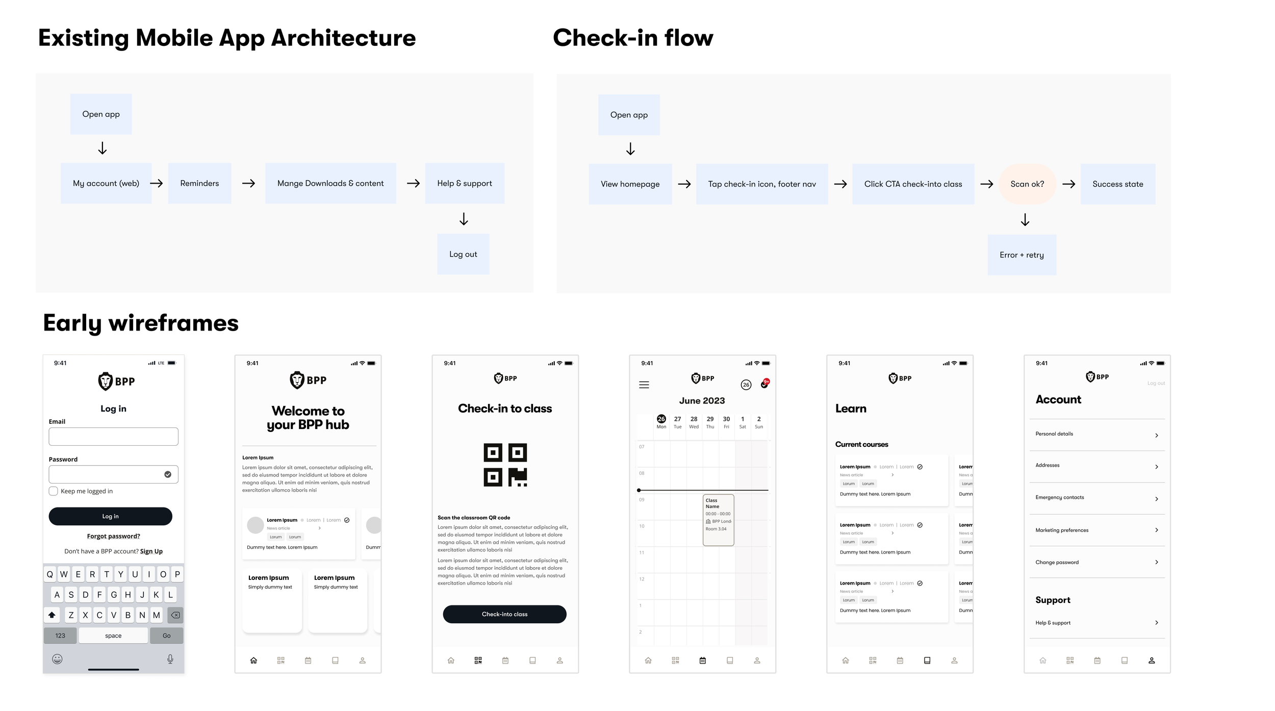
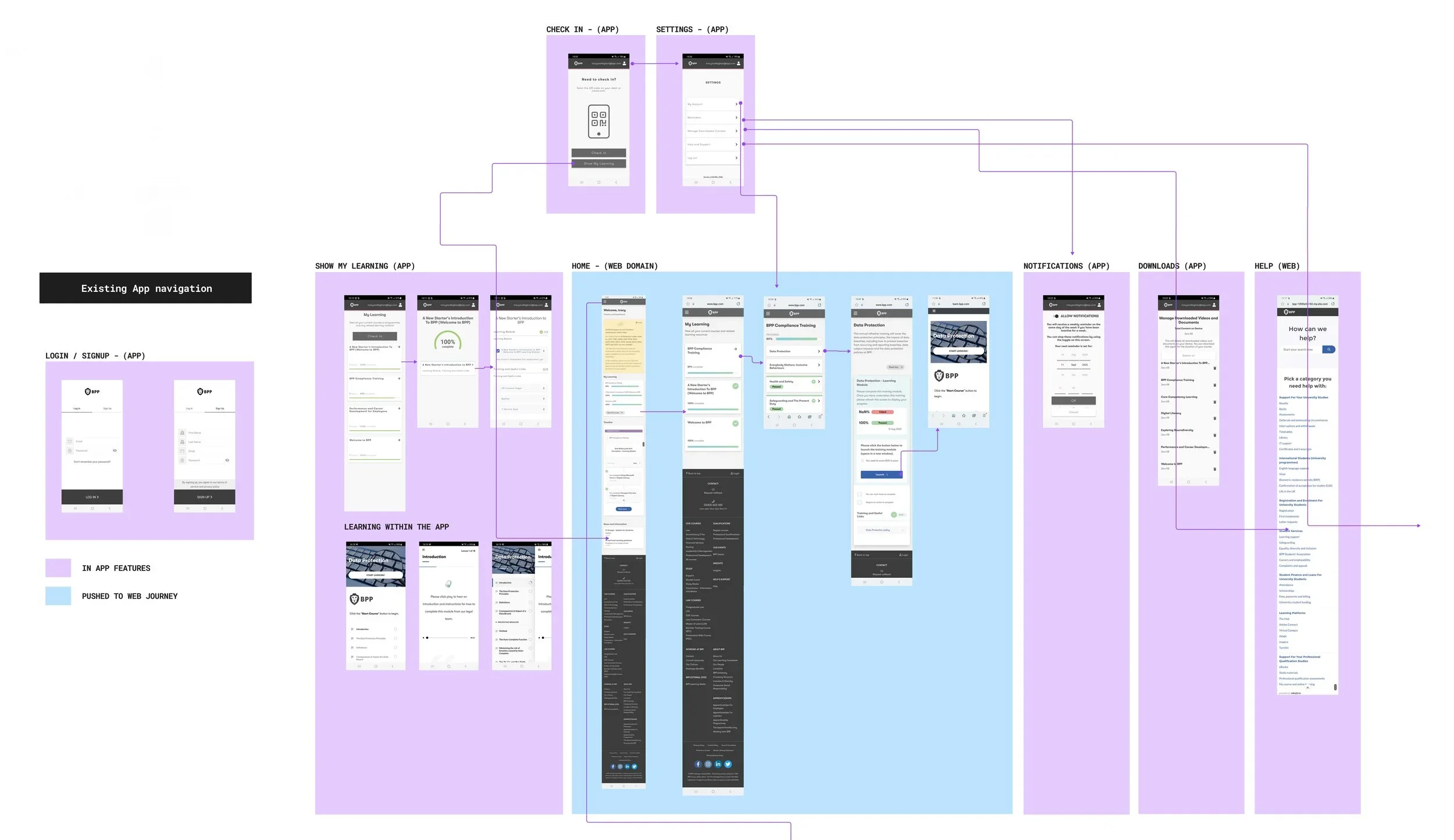
The existing app
Early research showed many students were unaware the legacy BPP app existed which highlighted the need for a useful and engaging mobile experience. A mobile learning companion.

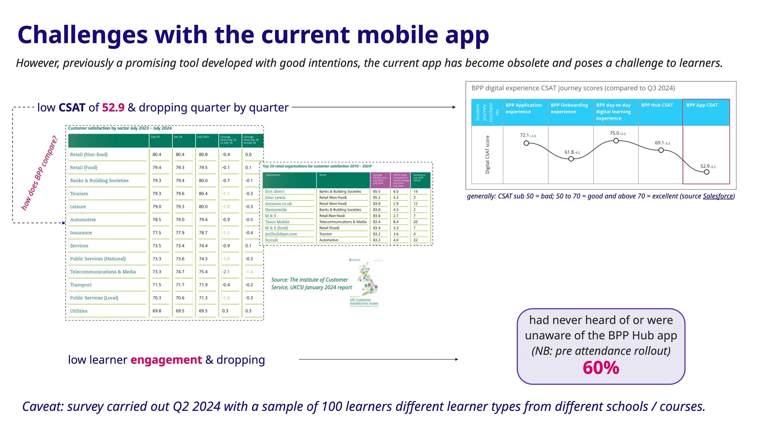
52.9
The lowest CSAT score of all BPP services
Learner engagement was dropping
research & discovery
To ground the design in real student behaviours, we contributed to both quantitative and qualitative research across the student lifecycle.
Research activities
Designed and distributed a survey to 800+ students
Proposed an in-app CSAT feedback loop to continuously capture user sentiment
Conducted student interviews to validate early concepts and gather behavioural insights
Reviewed support pain points and recurring usability concerns
what we tested
Current app experience
Desired features for the new app
Notification and alert preferences
Appetite for roadmap features
why we tested it
To validate roadmap assumptions
To identify gaps in the current experience
To understand learner priorities and pain points
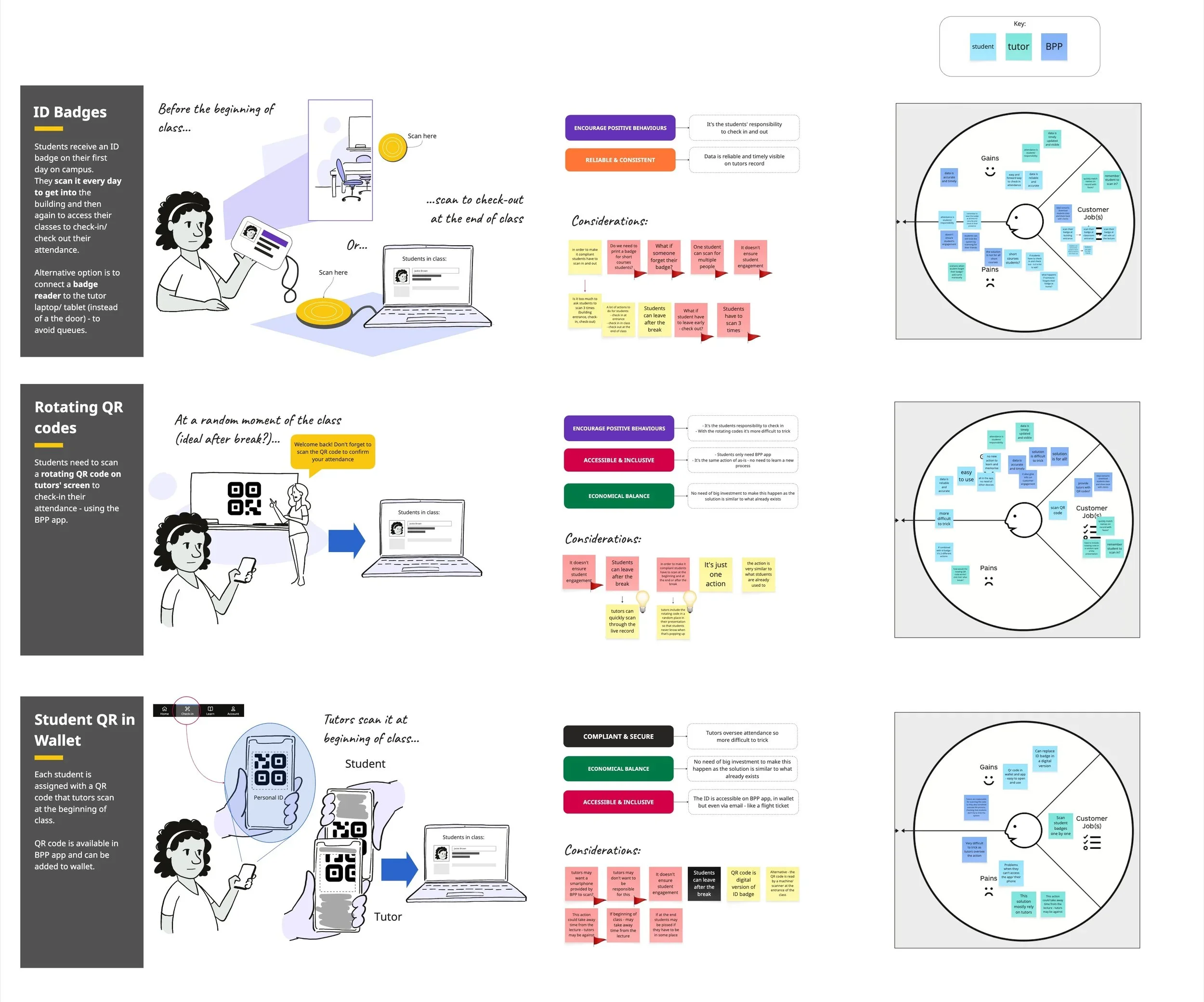
To co‑create and ideate with students
To ensure the MVP delivered immediate value
Key insights
Students responded positively to the idea of a more capable mobile experience, but wanted more — more functionality, more personalisation, and everything in one place.
Navigation and discoverability emerged as increasingly critical as the feature set grew. Students consistently associated active learning with desktop, while mobile was seen as an organisational companion.
users wanted
Show timetables clearly
Provide visibility on fees and outstanding payments
Improve access to learning materials on the go
Provide a simple way to submit and track queries
Self-serve administrative tasks
Stay informed through timely updates and notifications
Opportunities
Product Opportunities
Improve usability and discoverability across the app
Surface more timely and relevant information
Reduce friction around administrative tasks
Lay foundations for personalisation and self-service
Strategic Opportunities
Increase daily active usage and long-term retention
Improve student satisfaction and app sentiment
Reduce timetable-related support tickets
Strengthen mobile adoption across the student lifecycle
Prioritisation & trade-offs
Given the aggressive timeline, we needed to make strategic trade‑offs. For MVP we prioritised features that:
Delivered immediate value
Reduced reliance on web redirects
Were technically feasible within the timeframe
Supported core student logistics
We deferred:
Some high‑value features, such as fee payment tracking, required cross‑functional integration with legacy systems that were being decommissioned. Engineering confirmed these would require significantly more time and coordination, so we moved them into post‑MVP roadmap.
How we made decisions
We partnered with Product and Engineering to:
Map desirability (student need)
Assess feasibility (tech constraints)
Evaluate viability (business goals)
Build a prioritisation matrix
Define MVP vs. future phases
This ensured we delivered a high‑impact MVP without compromising long‑term scalability.
Design strategy
Based on insights, we defined a strategy focused on:
Reducing friction in daily student tasks
Improving clarity around timetables, attendance, and queries
Creating a unified mobile experience that didn’t rely on web redirects
Building trust through transparency (payments, attendance, updates)
Establishing a scalable foundation for future features like chat, payments, and results
phased delivery
The app was delivered across two MVPs, allowing us to validate core functionality before expanding the feature set.
MVP 1 : Core Experience. Key features included:
Real-time timetable access with live updates
Redesigned navigation and information hierarchy
My Account management for personal details
Improved QR code check-in with clearer success and failure states
MVP 2 : Extending the Experience
With the core in place, the second release added:
Push and in-app notifications for timetable updates and key events
AI chatbot integration for instant support outside office hours
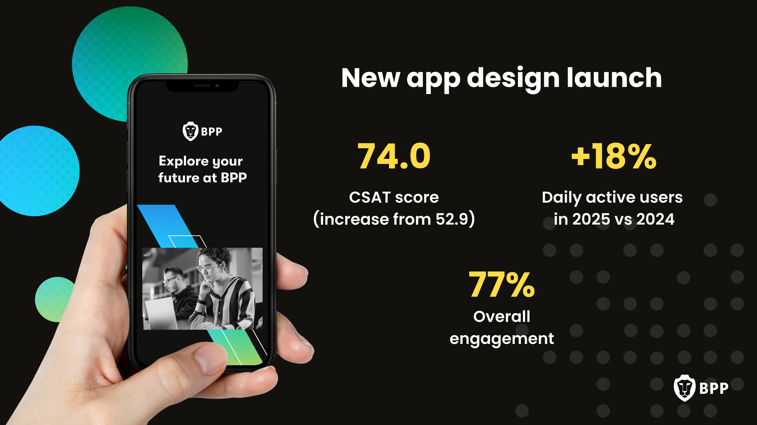
Impact
88%
adoption rate of
the new app
74
CSAT increased
over 30 points
+40%
daily active users
+65%
weekly active users
These early indicators validated our decision to prioritise clarity, logistics, and mobile‑first workflows in the MVP.
+74%
monthly active users